
01 / Patient Experiences
Directions for the people who never registered.
A floor plan and turn-by-turn directions that open from one poster QR with no sign-in, in thirteen languages, and stay correct when part of the building stops working.
The only thing standing between a visitor and the map is a code already printed on the wall next to them.
Scanning the poster opens the app. The link carries the facility join code, so nothing is typed and nothing is remembered. That code is the only gate in the reader experience, and what it gates is narrow: it stops the building's announcement feed becoming a public oracle for what is happening inside the hospital right now.
It is deliberately not a security boundary for anything else. It is printed on a poster, so anyone physically in the room already has it, and that is the point. The people most likely to be lost in a hospital are the ones who never registered anywhere, so wayfinding has to work before and without any registration at all.
The API refuses to boot publicly exposed without a join code and non-default secrets. This is enforced at start-up, not documented as a recommendation. A deployment that skipped it does not come up.
No sign-in
There is no account to create and nothing to remember. Readers have no identity in this system.
No reader tokens
No sessions, no cookies carrying identity, nothing to steal from a phone left on a chair.
One stable code
The poster QR resolves to a public URL that does not change, so the printed poster never goes stale.
Nothing summons anyone
No urgent button, no nurse call, no check-in. The consent screen says so before anything else loads.
Configurable identity
Facility name and site list drive the wordmark, the browser tab and announcement targeting. Renaming a deployment is configuration, not a code change.
Routing
The banner and the directions are not allowed to disagree.
The most damaging failure in hospital wayfinding is not a missing map. It is a map that confidently routes someone through a lift that a sign three metres away says is out of order. Staff publish the notice, and the same action removes the place from routing.
A graph, not a picture
The floor plan is backed by map nodes and edges with a server-side router, not an image with hotspots. Adding a corridor closure changes the route, because the route is computed rather than drawn.
Turn words, not translated sentences
Direction words come from each device's own shipped dictionary. A reader gets "straight ahead, then right" rendered locally. It is never a sentence that had to survive a round trip to a translation provider while somebody stands in a corridor.
Sensitive destinations
Destinations flagged as sensitive are unreachable for every reader in this configuration, because every reader is anonymous. That is the correct outcome, and it is pinned by a test rather than discovered during a pilot.
The same graph answers a second question
Asset Tracking asks it how far away a machine is, so nearest first on the equipment list is ranked on the distances this router computes, past the closures this router already knows about. A route to a defibrillator and a route to Medical Imaging are the same question about the same building, so there is no second router.
No map, no problem
Every other module degrades gracefully with no map data loaded. Directions are simply absent, distances are simply absent, and nothing else breaks.
Thirteen languages, ordered by who actually walks through the door.
The registry is ordered by StatsCan 2021 Census prevalence in Ontario, not by what was convenient to add. Arabic, Urdu and Persian get real right-to-left layout driven by the document direction and logical CSS, rather than a mirrored stylesheet.
Every script self-hosted
Lexend subsets for Latin, plus seven subsetted Noto faces: Simplified
and Traditional Han, Arabic, Urdu Nastaliq, Devanagari, Gurmukhi and
Tamil. No CDN, strict CSP, font-src 'self'.
Subset to what is actually said
Faces are cut to exactly the codepoints present in the translations, so about 240 KB in total, against roughly 10 MB unsubsetted. A test fails the build if the translations drift from the committed font bytes.
The part unicode-range cannot do
Simplified and Traditional Han share codepoints, and so do Arabic and
Urdu. :lang() rules disambiguate them, because a Unicode
range alone would render Urdu in an Arabic face and quietly look wrong to
everyone who reads it.
English and French are the human-verified source. Every other registered language carries a machine translation of the interface strings behind an explicit auto-translated disclaimer. External machine translation is off by default; the providers that would send text out of the country additionally refuse to boot without a written residency acknowledgement, because a staff-authored announcement is still the hospital's information leaving Canada.
Accessibility
Built for AODA. Not yet attested to it.
Ontario's binding standard for hospital web content is WCAG 2.0 Level AA under the AODA Integrated Accessibility Standards Regulation. 2.1 AA is the internal target: what the project aims at, not what the law requires.
Audited in a real browser, last re-run 7 September 2026. Twenty-one screens across all four apps clear WCAG 2.0 and 2.1 Level A and AA with zero violations, measured in real Chrome against the bundles a deployment actually serves. That change mattered more than it sounds. The suites had run under a renderer that does not lay out or paint, so roughly the most consequential third of the rules had never run at all, and the first real-browser pass found six failures, every one of them a contrast failure. A later pass found seventeen more that had made an earlier "zero violations" untrue.
It is still the project auditing itself. Fifteen results are recorded as needing a human decision rather than counted as passes, no audit with assistive-technology users has been carried out, and the screen-reader script has been walked by the author rather than by somebody who uses one daily. An independent audit is a pre-deployment gate, named as one so a facility plans for it rather than discovering it.
Larger-text toggle
A first-class control in the reader app, not a browser zoom the visitor has to know about.
Language picker
A fully labelled native <select>, chosen over a custom widget precisely because it already works with every assistive technology.
Live regions
ARIA live regions announce a new notice without stealing focus from whatever the reader is doing.
Focus handling
Skip link, visible focus, focus traps in dialogs, and focus restored to where it came from on close.
Direction and language
Per-language lang and dir on the document, so screen readers switch pronunciation and layout flips properly.
Motion and touch
Reduced-motion support, large touch targets, and no hover-only interaction anywhere in the reader app.
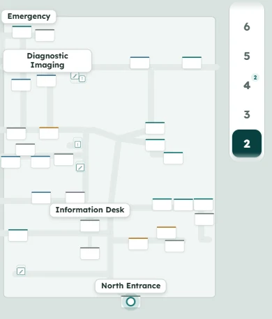
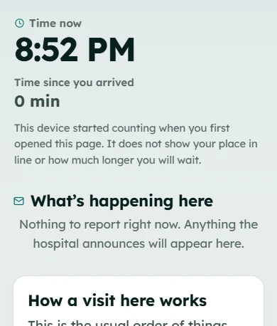
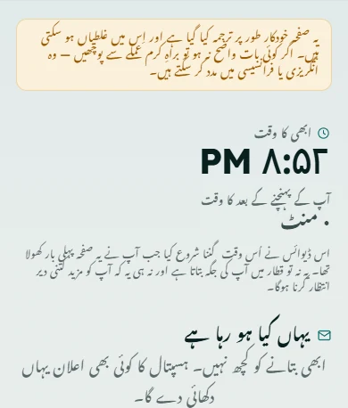
Development build, seeded data, no deployment. These are the captures the accessibility harness took on 2026-08-25, cropped only.
A reader can send exactly one kind of thing, and it is about a place.
From a room or lift's card on the map, and from nowhere else in the app, a reader can report that it is not working, blocked, or wrongly signed. Three of the four choices carry no text at all. The fourth is a short note, capped at 240 characters, encrypted at rest, and refused outright if it contains emergency wording; the reader is shown directions to the desk instead, and nothing is stored.
There is no reply path, no acknowledgement, no severity, and no reader identity attached to it. The shape of the record is the argument: there is nowhere in that table to put a person.
NOT_WORKING
No text sent
BLOCKED
No text sent
WRONG_SIGN
No text sent
OTHER
240 characters, encrypted at rest
Next: what happens when the building has something to say.
Operational Communication is the other half of the reader experience: the closed set of notices a hospital can raise, why three notice kinds were deleted, and the latency the system admits to.